Wednesday 31 October 2012

Adobe Illustrator meets Duchamp & Ray

Above is my first attempt at replicating the Duchamp-Ray rotary design. My second, third, and fourth attempts aren't as good as the first. When I was making the first iteration, it was from memory. When I tried to replicate it straight from the image, my attempts looked muddled and too complex. In this case, simple is better.

Tuesday 30 October 2012

Children's Art: Sophie

Dragonfly by Sophie, age 7.5
More and more I'm inspired by children's artwork. In his day, Picasso was too.  
"It took me four years to paint like Raphael, but a lifetime to paint like a child." – Pablo Picasso

Friday 26 October 2012

Week 39: Adobe Illustrator

Hexdots © Karen Thiessen, 2012
Even though I'm wading through the chapters on working with text* in my Adobe Illustrator manual, I still need the occasional hit of playing with pattern. I created the green shapes by making a bunch of hexagons in varying sizes and then joining them together with the expand button. The pattern was a tad dull until I added red dots. It has the feel of hand grenade shaped olives with pimentos. Do you see it?

* For proof that I'm learning about text, see Monday's Vincent Van Gogh quote.

Thursday 25 October 2012

Fibreworks 2012: Jolie Bird

Jolie Bird Chair Wrapped in Gold Thread, 2011; Photo credit: Karen Thiessen, 2012
At first glance, the above chair by Jolie Bird appears to be painted gold. Take a closer look. Do you see it? The entire chair is wrapped in gold cotton thread. I've wrapped objects with thread before and they've never looked this neat. Wrapping the legs and dowels is finicky and time-consuming, but not so hard. Coiling the thread to cover the seat is another thing altogether: it would take the infinite patience of an angel. And then some.
Jolie Bird Chair Wrapped in Gold Thread, 2011; Photo credit: Karen Thiessen, 2012
I snooped around Jolie's website and learned that she has a BFA in fibre arts from the Alberta College of Art and Design and is an MFA candidate at NSCAD University. Wrapping objects with thread is not new and each artist takes a different approach. I am reminded of Celeste Scopelites' wrapped wine glasses, The Three Graces, from the Sotto Voce exhibition at the Textile Museum of Canada (1998-1999). Jolie obscures entire objects with thread, Scopelites wrapped portions of objects. Both artists' results are impressive.

* Photographs taken with permission from Mary Misner, Director of Cambridge Galleries

Wednesday 24 October 2012

Fibreworks 2012: Liv Pedersen

Liv Pedersen Gertrud and Max, 2012; Photo credit: Karen Thiessen, 2012
Liv Pedersen is a Danish-born Calgary-based weaver who trained as a painter and social worker before turning to fibre. Max and Gertrude are two separate tapestry weavings that read well paired together. Don't they make a fine couple? They have a fun cartoon quality that I don't expect to see in a tapestry weaving. Gertrud could be Homer Simpson's long lost sister and tough guy Max is telling us to stay away from his sweetheart. Or else!
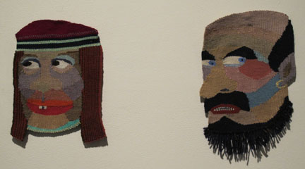
Liv Pedersen Max, 2012; Photo credit: Karen Thiessen, 2012
I love that Pedersen shaped the faces free of a background so that they stand alone. Max's fringed beard is another nice detail.
Liv Pedersen Gertrud, 2012; Photo credit: Karen Thiessen, 2012
Gertrud's pillow lips and winsome smile add to her mystique. I wonder what fictitious character was the inspiration behind Gertrud. The more I look at Max and Gertrud, the more I like them. Couldn't you see a graphic novel based on them?

In case you were wondering, Gertrud is 31 X 31 cm and Max is 33 X 23 cm. I was curious to see the hanging devices, but taking an artwork off the wall in the middle of an art opening is usually verboten, so I didn't.

Artist statement: "The primitive Dutch plank loom has for many years been my favorite tool for expressing myself. Lately my small tapestries have been shaped, depicting imaginary faces of freaks and creatures that are more fantasy than portraiture. They are inspired by folk tales and literature. The weaving process takes on a life of its own and often the faces are woven upside down to allow for a more intuitive approach."

* Photographs taken with permission from Mary Misner, Director of Cambridge Galleries

Tuesday 23 October 2012

Fibreworks 2012: Petrina Ng

Petrina Ng Apparently forever isn't long enough (dog fur diamonds); Photo Credit: Karen Thiessen, 2012
From a distance Petrina Ng's Apparently forever isn't long enough (dog fur diamonds) didn't capture my attention. I almost walked on by and I'm glad I stopped to take a closer look. The work is quiet, subdued, deep. 
Petrina Ng Apparently forever isn't long enough; Photo Credit: Karen Thiessen, 2012
Petrina felted seven diamonds from a decade of collected fur of her now deceased childhood pet dog. Her mother, probably the one who brushed the dog, collected the fur. She sounds like my mom who did the same thing with the fur of Nanook, our Siberian Husky. Petrina's act of making dog fur diamonds references a new trend of commissioning memorial diamonds that are made from compressed cremation remains. Who knew?
Petrina Ng Apparently forever isn't long enough detail; Photo credit: Karen Thiessen, 2012
The story behind these quiet objects drew me in and invited me to linger with them. Naturally, I'd like to know more about her dog. What breed was it? What was its name? If you go to Petrina's website, you'll learn that she offers two purchase options. One is to purchase a limited edition set of seven dog fur diamonds in a custom made vitrine. The second option is a limited edition set of  seven high-quality yellow diamonds made from seven dog fur diamonds, also in a custom made vitrine.

* Photographs taken with permission from Mary Misner, Director of Cambridge Galleries

Monday 22 October 2012

Quote: Vincent Van Gogh

* here's proof that I'm finally tackling the chapters on working with text in my Adobe Illustrator manual.

Friday 19 October 2012

Week 38: Adobe Illustrator

Crossed II © Karen Thiessen, 2012
By chance I stumbled across this pillow on the Toronto Modern Quilt Guild and I was blown away. From the get-go I could see that piecing crosses would take a lot of planning. Most of my quilt making is improvisational, so this boggles my mind. I decided to mock up a few cross patterns in Adobe Illustrator to get a feel for how one would go about piecing nestled crosses without going mad. A linear-thinking-recipe-follower could do it with ease. I could not. 
Crossed I © Karen Thiessen, 2012
But wait, I checked out the pillow maker's blog, veronicamade and followed her link to Sew, Mama, Sew! where I found instructions that even I, a divergent thinking contrarian, could follow. Using lightweight fusible interfacing and some sewing trickery, piecing a crosses quilt top would seem a lot like collage. Who knows, maybe one day I'll give it a try. 

Thursday 18 October 2012

Mola

Mola; Photo credit: Karen Thiessen, 2012
My mom bought this mola in Arizona for me early this year. Isn't it gorgeous? I'd like to hang it as it is, without framing it, but first I need to add a hanging device that won't stress the textile. In 2001 I was in a four-person show called Red at the Textile Museum of Canada. Margaret Ballantyne, the conservator, generously taught me how to attach hanging devices that evenly distribute the tension and therefore don't stress textiles. Needless to say, I redid all my hanging devices for the show. She also showed me how to properly roll my textiles. The proper hanging device involves sewing a "female" strip of Velcro onto a muslin strip, and then hand-sewing the muslin strip-Velcro combo to the textile. To hang the textile, simply staple the "male" Velcro strip to the wall and press the male and female strips together. If you don't want to put staples in your wall, you can glue or staple the "male" Velcro strip to a thin piece of wood, drill holes on either end of the wood, and hang it level with two nails.
Mola detail; Photo credit: Karen Thiessen, 2012
Back to the mola, don't the faces look like monkey kings? I wonder about the story behind this textile and who made it.
Mola detail; Photo credit: Karen Thiessen, 2012
The above image reminds me of a Matryoshka doll.

Wednesday 17 October 2012

Studio Series: Folded Patterns II

Smocked polka dot dress; Photo credit: Karen Thiessen, 2012
In this post I wrote about seeing my young friend's smocked polka dot dress and being inspired by the distorted dots. I now have a picture of the dress to show you. Below is a pattern that I created from a scan of one of my folded drawings that I then put into repeat in Photoshop. I've digitally printed this pattern onto fabric, cut it into tag shapes, and then added my signature obsessive stitching.
Black & White folded pattern I © Karen Thiessen, 2012

Tuesday 16 October 2012

Jamesville Ceramics & Paints

Old-fashioned hardware stores are a dying breed as mega-stores muscle them out of business. Jamesville Ceramics and Paints is the real deal and meets the needs of downtown Hamilton where mega-stores fear to tread (thank goodness!). The service is friendly and the store has soul. It's a place where you want to take your time looking at all the cool gizmos. I especially like the red and yellow stripes that mark a grade change from one part of the store to another. Whether you want to can a batch of tomatoes or caulk your old windows, you can find what you need at Jamesville Ceramics and Paints.


Monday 15 October 2012

Quotes: Stephen King

"Talent is cheaper than table salt. What separates the talented individual from the successful one is a lot of hard work." – Stephen King

Friday 12 October 2012

Week 37: Adobe Illustrator

Dotted Bulls-eye © Karen Thiessen, 2012
I practice Adobe Illustrator five days a week when I am not on vacation. This amounts to over 110 hours during 166 days this year so far. I have practiced yoga every day this year and this amounts to just over 100 hours during the 286 days in 2012 (as of today). From these statistics, it's obvious that Adobe Illustrator is claiming more of my time for 2012. On the other hand, I've practiced yoga for 17 years, and daily since Lent 2011 – that's 594 days in a row. Clearly AI has won the battle, but yoga has won the war.

My fascination with the dotted line is providing the right balance (a.k.a. diversion) to my current goal to get through the chapters on using text in Adobe Illustrator. This pattern has an Aboriginal Australian pattern feel to it.

Thursday 11 October 2012

Fibreworks 2012: Tammy Sutherland

Tammy Sutherland How to Lift, 2010; Photo credit: Karen Thiessen, 2012
Fibreworks 2012 is a mix of intimate, engaging textiles and truly bizarre artwork. Tammy Sutherland's How to Lift fits the former category. Before I extoll the virtues of Tammy's work, I must come clean: Tammy is an old friend from our days at NSCAD. Nonetheless, my appreciation of her work is genuine, otherwise I wouldn't write about it here.

How to Lift is small: 38 cm wide by 29 cm high (15" X 11.4") and it is the smallest stand-alone piece in the show. Small is beautiful. The scale, intimate subject matter, irregular shape, and thoughtful details invite you to come close and take time with it and the quirky imagery forces you to come up with your own narrative of what it is about. Furthermore, that the piece is bound on three sides and not on the fourth, indicates to me that maybe this is the first piece of a series. Tammy's artist statement indicates that it is part of a series, but does not say where it resides.
Tammy Sutherland How to Lift, detail; Photo credit: Karen Thiessen, 2012
The x's are a nice touch, as are the small details that you only notice once you've looked at it long enough, like the tiny red stitches that attach the head of the cartoon creature to the body of the textile.
Tammy Sutherland How to Lift, detail; Photo credit: Karen Thiessen, 2012
Tammy is now back in her home province of Manitoba where she juggles a studio practice, two young children, and work at the Manitoba Crafts Council. I hope to see more of her work make its way to Ontario.

For those who need to know more, here's the didactic text from the exhibition:

Tammy Sutherland, Winnipeg, MB
How to lift, 2010 
Hand-dyed and printed cotton, embroidery thread, appliqué, screen printing, hand and machine pieced

Artist Statement:
My art is an act of salvage. I reclaim "waste" materials through repetitive, contemplative and sometimes mind-numbing work. I work with the simplest of processes: hand sewing, open screen-printing, and improvisational dyeing and cutting.

This series of small quilted pieces features embroidered line drawn images inspired by first aid textbooks and newspaper clippings. Otherworldly appliquéd creatures and embellishments emerge from the artist's colourful scrap pile to accompany the unknowing human figures on their journey through an imagined "post-historic" landscape. The past may be closed to them, but an opening ahead beckons them into an infinite and borderless space.


These small tableaus may point towards vulnerability, loss, compassion and a messy kind of beauty.

* Photographs taken with permission from Mary Misner, Director of Cambridge Galleries

Wednesday 10 October 2012

Supercrawl 2012: Papier Maché Necklace

A giant blobby necklace made of papier machĂ©d balloons is probably not what you would expect to see on my blog. Neither the necklace nor the presentation are exceptional. The moment I saw the necklace I was reminded of a papier machĂ© igloo that I made in Kindergarten and it brought back a flood of good memories. Unlike the above necklace, some of whose beads look soft and sunken, my igloo was sturdy. With another classmate, I covered a balloon with strips of paste covered newspaper, followed up with a layer of white paper towel. I can still remember the feel of the warm paste as I squeegeed the excess from the torn paper strip with my index and middle fingers before layering it onto the balloon. Once the papier machĂ©d balloon was firm and dry, our teacher cut it in half, and cut a small half circle for the igloo door. Then I was free to draw pencil lines on my igloo to represent the snow bricks. Shortly after I made the igloo, my mom made a purple plaid dress coat with a matching hat for me. My ever practical mom appropriated my igloo to become the hat form. When I outgrew the hat and coat, they, along with my igloo, were given to another young girl. I still think about that igloo.

Reflecting on childhood crafts and my anxiety about an upcoming solo show, I was reminded of this Sheryl Crow quote:
"I called [Bob Dylan]. ... I said, "I am totally wigged out and I don't know what I am supposed to be doing, and I've got a lot of pressure to incorporate what's going on." He said, "Go back to your roots. Take out the albums that you loved and play those songs. Get your band together and rehearse those songs, and then you will start writing." And that's what I did." – Sheryl Crow, Rolling Stone, October 31, 2002.
Maybe it's time that I went back to my roots and played with papier machĂ© once again.

Tuesday 9 October 2012

Supercrawl 2012: Toronto Hyperbolic Crochet Reef


One highlight of September's Supercrawl was the Toronto Hyperbolic Crochet Reef installation at White Elephant on James Street North. Watch the TED talk below to get some context for this project.

Monday 8 October 2012

Quotes: Brian Eno

"If you want someone to feel emotion, you have to make them let go. Listening to something is an act of surrender." – Brian Eno

Friday 5 October 2012

Week 36: Adobe Illustrator

W pattern © Karen Thiessen 2012
This pattern is brought to you by the letter "W." I'm making more of an effort to go through my Adobe Illustrator manual and I'm learning about text right now. It's a tad boring so I'm playing with making patterns using text. Text does not behave the same as other motifs. When I group, copy, and paste the modules, they shift slightly, so the pattern is not as precise as I am used to. To compensate I layered it with another colour and I like how the pattern looks, especially with my newly expanded colour palette. 

Happy Canadian Thanksgiving to you all!

Thursday 4 October 2012

Pamela Lakin @ DVSA Gallery

Pamela Lakin Simone with Pearl, 2011; Photo credit: Karen Thiessen, 2012
This is one of those awkward posts where words are inadequate. Normally portraiture doesn't speak to me, so I was surprised that the paintings of Pamela Lakin hit me like a Mack truck. I was trying to understand what quality draws me to the portraits. A painter friend told me that Pamela does not paint from photographs. She uses oil paints and a live model. Maybe the combination of an historic material (oils) and approach (live model) with contemporary models is the key to what draws me so strongly to the work. All I know is that Simone with Pearl grabbed me the first time that I saw it, and it has stayed with me. I met Pamela at the exhibition opening at the Dundas Valley School of Art Gallery and she told me that Simone with Pearl practically painted itself. Maybe I unconsciously sense the flow and spirit embedded in the painting.
Pamela Lakin Simone I, 2010; Photo credit: Karen Thiessen, 2012
The lighting in the gallery made it difficult to photograph the work. Oil paint has a slight sheen. My photos do not do justice to the work and the paintings are best seen in person which you can do until October 13, 2012. See the DVSA website for gallery hours and location. Pamela's work is part of a four-person exhibit titled Connecting with Life
Pamela Lakin; Photo credit: Karen Thiessen, 2012
Pamela Lakin Micaela, 2010; Photo credit: Karen Thiessen, 2012
Simone with Pearl and Micaela are my favourite paintings in the show. I like the simple backgrounds, the rich colour, and that the models look three-dimensional. Pamela has two beautiful adult daughters and I'd love to see their likenesses in oil one day. 
* Photographed with permission from Pamela Lakin.

Wednesday 3 October 2012

Studio Series: Vat dye & Shibori workshop

The preparation process; Photo credit: Karen Thiessen, 2012
Lately I've been itching to get my gloved hands and some fabric into an indigo vat, so I took a class through Needlework. Roisin Fagan taught the class, and man oh man is she a great teacher. Roisin reminded me of my best yoga instructors who not only taught the poses, but also gave us information about anatomy and how the poses and our anatomy work together. Roisin shared the "anatomy" of dyes, laundry soap, and other stuff, a.k.a. chemistry. Even though I have years of textile education and experience under my belt, I learned a lot. If you have a chance to take a class with Roisin, do so. She is calm, organized and is an excellent communicator.

It's been a long time since I dyed with indigo, so I was pleased to refresh my skills. Roisin taught us various mechanical resists (clamping, sewing, tying). She also brought three vat dyes in jade, gold, and black. In the above picture you'll see the before images. I pieced a few hexagon clusters to over-dye and I brought some ugly fabrics to transform. In the above image, you can see the tied circles fabric before dyeing (dusty green fabric in the 6 o'clock position).
Vat dye results; Photo credit: Karen Thiessen, 2012
I really like how the dusty green (not my favourite colour) picked up the indigo. Roisin taught us how to tie the small circles. If I take another shibori class, I'll prepare several fabrics ahead of time with the tied circles. It's time consuming but worth the while. In the above image, the tied circles fabric is in the 8 o'clock position, just below the jade green striped fabric.
More vat dye results; Photo credit: Karen Thiessen, 2012
Four people, including myself, took the class. In the above photo are the results from the class. Black vat dye on linen is gorgeous. Maybe I'll try some vat dyeing in my garage next summer. It's temperature sensitive and stinky, so for the sake of my hubby and visitors, I won't try this in the house.

Tuesday 2 October 2012

TOAE 2012: Jen Kneulman

Jen Kneulman textiles; Photo credit Karen Thiessen, 2012
Jen Kneulman runs Freshly Printed and is currently an artist-in-residence in the Harbourfront textile studio. She's a graduate the Ontario College of Art and Design's Fibre program. Jen's imagery has an Ontario-vintage-postcard feel and I really like how the top three tea towels work together. It would be difficult to buy just one.
Jen Kneulman textiles; Photo credit Karen Thiessen, 2012
The canning jars are one of my favourites. Note how she prints the outlines and adds small dashes of colour here and there. Nice.
Jen Kneulman textiles; Photo credit Karen Thiessen, 2012
 Jen's displays were fun. Hey, I had an oven in that colour at one time!
Jen Kneulman textiles; Photo credit Karen Thiessen, 2012
The Ontario tea towel is icing on the cake. Jen's work all fits nicely together with a cohesive look and colour palette. I look forward to seeing what she cooks up for the next TOAE.

Monday 1 October 2012

Quotes: Matthew Fox

* I'm learning how to play with text in Adobe Illustrator. This is my first successful experiment.